We treat our websites like a passion project. We spend weeks obsessing over the perfect font or exactly how to word the "About" page. Why? Because we think when we finally get a visitor, they’re going to enjoy a cup of coffee while reading every word.
It’s a nice thought, but it’s completely wrong.
The reality is much more chaotic. When someone lands on your site, they aren’t "perusing." They’re in a hurry, they’re probably skeptical, and they’re already primed to find a reason to go back to their search.
You have about five seconds to prove you aren't a waste of their time. If you can’t pass that initial "gut check," it doesn't matter how good your product is or how much the rest of your copy shines; they’ll never stay long enough to read it.
To fix your bounce rate, you first have to understand the split-second mechanics of how your visitors are judging you.
The Psychology of the Split-Second Decision
You might have this idea that your average visitor has taken time out of their day to solve their problem and is carefully reading through every talking point on your site. That would be incredible, but unfortunately, they’re not.
Most visitors arrive on your site with cognitive momentum from wherever they came from (Google, ad, referral, etc). It also means there is a purpose to what they are doing, whether that be learning more about their problem or looking for a solution.
This means they’re doing something called threat + relevance scanning: they’re trying to understand if your site is what they need. More importantly, they’re not consuming content or perusing calmly.
What does all of this mean? It means they’re asking, “Do I understand this fast enough to stay?” In other words, if your site doesn’t answer that question, you will lose people before you even get the chance to persuade them.
The 3 Snap Judgments Visitors Make (Almost Instantly)
The good news is that we already know what helps carry readers' momentum forward. It’s as simple as answering three questions.
What Is This?
The first question is all about pattern recognition, which translates to clarity via categorization. So, you need to make it clear to a visitor what your site is about and what you can do for them. Yes, “what you can do for them”. After all, they’re there to solve their problem, not to support you.
This means you need to make this apparent in a way that allows the reader to label your site in one mental sentence. If you don’t do that, the reader will experience their first point of friction. Which means you need to be very specific and clear about your positioning.
So, if you have an about page detailing your service, it needs to not only create trust but also quickly explain what you can do.
A few common failure patterns are:
- Abstract slogans
- Metaphors without anchors
- Broad “we help businesses grow” statements
At the end of the day, every business should care, aim to help their audience grow, provide great service, etc. Those are empty statements because they should be inherently true. The problem with those statements is that they tell the visitor nothing about you and what you can do for them.
Is This for Me?
As much as we all like to think that we’re original or unique, we all do one thing: self-select. This isn’t a bad thing at all. We do this because we’re looking for things that make sense to our internal framework and, by extension, the story we tell ourselves about ourselves.
Your visitors are doing this too. So, when they visit your site, they will be looking for identity signals.
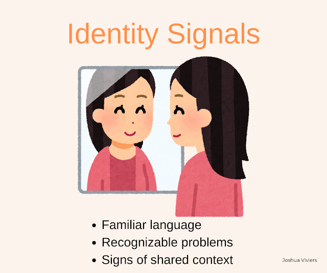
The consequence if they don’t see themselves? They self-select out.
What does this mean for you? Be extremely specific about who you’re speaking to. Do you know the phrase “if you try to appeal to everyone, you appeal to no one”? That’s extremely relevant here. Let that be your mantra for the day.
TLDR: Making a visitor see themselves in your site (or who they would like to become) leads to higher conversions and lower bounce rate.
Is This Safe to Engage With?
Do you know why it’s important to have testimonials or reviews on your site? Because people will do what other people have done. You might say, “Well, yes, it’s about building trust.” However, it’s more about risk reduction.
People are incredibly risk-averse. The primary operating mode that people run on is to do as many things as possible that reduce their suffering. So, they would not do anything that would increase it.
Trust, then, in this instance, means:
- “This won’t waste my time.”
- “I won’t regret clicking.”
You can build early trust without reviews or testimonials with:
- Clear expectations
- Grounded tone
- Absence of hype
Like how I’ve done with my conversion audit website (no, I’m not trying to brag). The fastest ways to break early trust are by:
- Overpromising
- Aggressive CTAs
- Vague outcomes
If you take anything away from this, it’s that you don’t build trust later. It’s fundamental. So, either it’s established immediately or it never fully recovers. For example, I still personally haven’t used Temu.
Why a High Bounce Rate ≠ Bad Traffic
The easiest conclusion many website owners and marketers reach when facing a high bounce rate is usually:
- “We’re not targeting the right people.”
- “Our visitors aren’t our target audience.”
- “They’re not smart enough to understand the benefits of our service.”
But a high bounce rate is not a diagnosis; it’s a behavioral outcome. And, in fact, a high bounce rate usually means:
- Wrong message
- Wrong intent
- Right audience, wrong framing
Think about it like this: if your early messaging was strong enough to get people on your site, and you have no problem with traffic, then what is it about your site that’s not engaging the visitors enough to stay?
Analytics are amazing for telling where people leave, but not why they do. And a high bounce rate + using analytics is particularly dangerous for:
- Early-stage sites
- Low traffic volumes
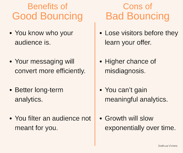
Simply because the sample size isn’t big enough to draw accurate conclusions. Especially when determining a good versus bad bouncing.
- Good Bouncing: The visitor realizes "I am a Plumber, and this is for Graphic Designers." (Success! You filtered them out).
- Bad Bouncing: The visitor is a Graphic Designer, but thinks, "I have no idea what this is." (Failure! You lost a lead).
Also, a low bounce rate doesn’t automatically mean success either; it’s just part of an equation. Do you know how many times I’ve left a site offering a “free service”, after staying more than 20 minutes, only to be met with a form or a subscription to unlock the result?
Sure, the bounce rate is low. But there’s still no conversion. And now I will never visit that site again.
Examples of Good vs Bad 5-Second Clarity
Talking about good vs bad clarity is one thing, but actually defining it is far more helpful. You can identify poor clarity with:
- Abstract headline
- No audience signal
- Outcome-first promise without context
- CTAs before persuasion
- No identifiable brand voice
- No hierarchy to guide the reader
Example of strong 5-second clarity:
- Immediate category clarity
- Explicit “this is for you if…”
- Logical, sequenced framing
- Clear brand voice
- Clear understanding of the reader's problem
You can have the exact same design, the same copywriter, and the same brand… but if there’s no alignment in what you do and how it’s presented to the reader, you are going to have a high bounce rate.
The key takeaway here is that an expressive website is not the same as one created for conversions and attention retention.
Why Optimization Can’t Fix a Failed 5-Second Test
Because optimization is a multiplier. There is an inherent assumption that the fundamental message is in place and there’s a clear hierarchy guiding the reader to a specific decision (sign up for your service or buy a product, etc).
The problem is that if your fundamental message is a zero, no amount of optimization will change the result (0×100 is still 0). I explain this in more detail in this more in-depth post about why websites fail.
So, you can go ahead and obsess over whether "Join Now" works better than "Sign Up." Or if you’ve got the correct font size with the perfect color buttons for CTAs. But it won’t change the fact that:
- Optimization is for when the right people are staying, but not clicking.
- The 5-Second Test is for when the right people aren't even staying long enough to see your offer.
There is no one to optimize for if they’ve already walked out the door. It’s the equivalent of a salesperson emerging from the shadows after a customer leaves. The moment is, unfortunately, gone.
What to Do If Your Site Fails the 5-Second Test
The first thing is to fight the urge to redesign your site or continue editing headlines, button colors, or the layout. Instead, you should examine:
- Message clarity
- Audience assumptions
- Intent mismatch
Why? Because you need to understand what is actually causing friction and reducing attention retention. You need to know what it is that is causing people to leave. Otherwise, you would quite literally be painting over the cracks in the foundation of your house in the dark.
This article is actually part of a deeper framework for diagnosing conversion friction, so if this has been helpful, you will love that.
