Most website advice is... bad. I hate to be the party pooper, but it's the truth.
When conversions dip, the "experts" tell you to change your button colors, test a new font, or add more testimonials. These aren't diagnoses; they are guesses. If your car won't start, you don't start by repainting the doors. You look under the hood.
Conversion problems are fundamentally diagnostic problems. Your website is a system of logic, and if that logic is broken, no amount of "persuasion gymnastics" will fix the ROI.
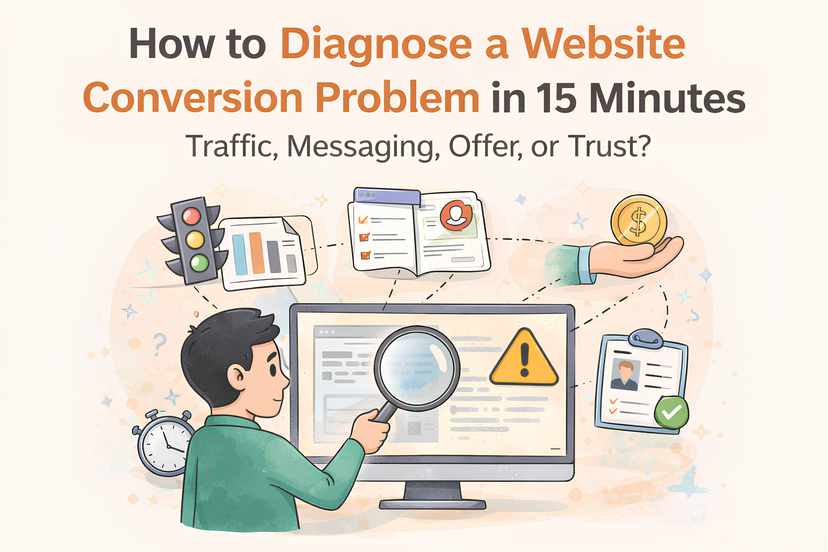
If you’ve been staring at a flat conversion rate for months, stop guessing. Here is the 15-minute audit process I use to identify whether your bottleneck is Traffic, Messaging, the Offer, or Trust.
Step 1: Traffic Quality (2 Minutes)
Before you blame the page, look at who is walking through the door.
The Question: Does the visitor's Intent match the page's Objective?
- The Check: Open your analytics. Where is the traffic coming from?
- Informational Intent: People landing on a blog post from a "How to..." Google search are looking for education, not a checkout page. If you're judging your "Services" page based on "Blog" traffic, your data is lying to you.
- Commercial Intent: People clicking a "Pricing" link or a bottom-of-funnel ad are ready to evaluate a solution.
- The Verdict: If your traffic is high but your "Time on Page" is under 10 seconds, you have a Traffic Mismatch. You are buying the wrong attention for the offer you’ve built.
Step 2: The 5-Second Clarity Test (3 Minutes)
This is where most B2B sites die. If a visitor has to "work" to understand you, they will leave.
The Question: Within 5 seconds, can a stranger answer:
- What is this? (The Category)
- Who is it for? (The Persona)
- What problem does it solve? (The Relief)
- The Check: Open your homepage, look at it for 5 seconds, and close the tab. If you used "boardroom poetry" (e.g., "Empowering Synergy for Global Scale"), you failed.
- The Verdict: If you can’t answer those three questions instantly, you have a Signal Failure. Your messaging is a "Clarity Leak."
Step 3: Offer Strength & The Relief Test (5 Minutes)
If people understand what you do but still aren't clicking, your "Solution" isn't sharp enough.
The Question: If a prospect fully understood exactly what you sell, would they feel a sense of Relief?
- The Check: Look at your primary offer.
- Are you selling "Features" (what you do) or "Outcomes" (what they get)?
- Is your transformation valuable enough to justify the friction of the price?
- The Verdict: If your offer is a "nice-to-have" (a vitamin) instead of a "must-have" (an aspirin), you have an Offer Problem. You are selling a solution to a problem they don't consider an emergency.
Step 4: Trust & Risk Architecture (5 Minutes)
This is the final hurdle. They want the solution, they like the offer, but they aren't sure about you.
The Question: Does the page prove that you are the safe, authoritative choice?
- The Check: Look for the three pillars of Safety:
- Proof: Do you have specific, non-generic results or case studies?
- Authority: Is there a clear human or brand presence that feels "real"?
- Risk Mitigation: Is the "Next Step" clear and low-risk (e.g., a discovery call vs. a "Buy Now" for a $10k service)?
- The Verdict: If the page feels "generic" or lacks a clear pathway forward, you have a Safety Failure. You’ve created curiosity, but you haven't built a bridge.
Why Most Founders Misdiagnose the Problem
The typical cycle of failure looks like this:
- Traffic drops = They run more ads (Scaling the noise).
- Conversions drop = They redesign the website (Painting the broken car).
But the real issue is rarely the pixels. It’s the thinking. Most of the time, the "broken" website is actually doing its job perfectly: it is revealing exactly where your business thinking is unclear. If you aren't clear on who you serve or what pain you solve, the website will reflect that fog back at the market.
When Do You Actually Need a Redesign?
You only need a full redesign if:
- The technical structure is broken (slow load speeds, broken links).
- The UX is genuinely unusable on mobile.
- The product or market has changed so fundamentally that the old site is a lie.
In 90% of cases, you don't need a new website. You need a Message–Intent–Trust realignment. You need to fix the logic, not the layout.
Closing Insight
Your website isn’t broken. It’s a mirror.
If the mirror is showing you a 1% conversion rate, don't blame the mirror. Look at what is standing in front of it.
If you’ve run this 15-minute audit and you’re still seeing a blur, it’s usually because you’re too close to the project to be objective. That’s where a Diagnostic Audit comes in. We don't guess; we locate the leak and fix the logic.
Diagnosis before optimization. Always.
